Wednesday, May 6, 2009

poem


dia:beacon

My excitement rose exponentially as we pulled into Dia:Beacon (after driving 3 hours, who can blame me?). The setting was pleasant and the lake and weather helped boost my mood. I was pumped. I’ve never heard of this place before but it seemed like a cool way to spend my day. I had looked it up on the Internet the night before and there were a few exhibitions I really wanted to check out. Before I talk about the artwork, I wanted to comment on how nicely the museum itself was laid out: they clearly took care to make it spacious and open and bright. I hate when museums are cramped and dark. That environment really added to my enjoyment of the day. Or maybe it was because me and Adriana spent a significant time talking to one of the cute guys who worked there.
The last piece that I found very effective was Michal Heizer’s North, East, South, West. Obviously they wouldn’t allow it but I felt this incredible anxiety to walk up to the edge of these massive inverse structures. His use of negative space, especially at such a huge magnitude, is thought provoking. Really, his artwork is nothing. He is presenting to the viewer a whole lot of nothing. This void, absence, is really the centre of his artwork. If a void can be a material, he monopolizes it. I would have loved to see it from 2 or 3 stories up, so I can look down onto it. These structures are TWENTY feet deep. That’s four Darcies! That’s absolutely insane!
Jean Chamberlain's work is another that I thoroughly enjoyed. His work has this personal and candid atmosphere to it. It seems to say “this is what I felt like doing now” and so, he did. The Privet is notoriously awesome. It’s massive scale and unpredictable twists keep the viewer locked in on it. It’s loud and ostentatious with it’s bright colours, but the ribbon twists and metal material make a nice triple juxtaposition (is that possible? Color shape and material can make a triple juxtaposition?) What makes this effective artwork is the way Chamberlain takes everyday elements— colored metal— and transforms them into new and exciting conjunctions. It’s fresh and different. It’s uniqueness makes it a key part of contemporary conceptual art. The last display that sticks out in my memory is Gerhard Richter’s Six Gray Mirrors. The massive size of each one combined with the significant space of the room had a powerful effect. Standing in the middle of the room, I felt the presence of negative space. This hybrid between glass and rock was semi transparent, and the reflections of the viewer in a murky depth was a great effect- seeing oneself this way isn’t what we’re used to. The full “me” wasn’t there, as in a clear mirror. I also like how in effect, you can never view this same piece twice. The combinations of lights and angles will always reflect something new- and the fact that there is six of these reinforces that idea

Saturday, April 25, 2009

Tuesday, April 14, 2009

one more just because i was bored


hehe i made one more entirely in illustrator to be sure i fulfilled every single requirement

word visualization

When I went onto the dictionary to look up words, I liked what I saw with 'torrid' because it means hot and dry, which i felt I could really emphasize through my art. I chose to make it look burned and crispy looking, and squished in to show how hot and dry it is! I did the coloring and erasing in Photoshop, then moved it to Illustrator to make the motions.

Tuesday, April 7, 2009

Concepts for Book

When looking through the provided resources, I decided I really liked the index card book. I'd love to do it so that the cards are horizontal but hanging vertically, so the pages go downward.

My poem offers me a lot of creative license, and I have a visual concept that would look perfect. I just need to pray my skills will make it look as amazing as it is in my head!

My idea is to make the background a textured light gray- almost "dreary" looking. The objects in it would be with abstract and artistic angles, and conceptual to the line of the poem they convey. I want to make it look like a textile vector, if that makes any sense. Almost cartoonish (vector) but elegant and simplistic (like a textile). I want it to look as if they are handmade and then scanned, instead of all on photoshop. I also want the objects to look "stiched" on.

For the type, I feel that a typewriter style would be perfect.

Enchantment and alchemic

To all of you who have along the way
Pulled stars from the sky
And placed them onto the blue canvas
Of oiled frenzied fragments
That is my heart
Over the years contented/discontented
As in what it is to know
Each other -
Thoughtfully / openly/ through a distance
In ash, fog and things of light
Night / and along the scalloped edge of
The
darkest missing parts
In wind / wideness and wonder
Over the unfolded and closed
What is perhaps or never shall

Enchantment and alchemic
Poised / perilous /
poetry

I take these glittering
Great colors -

The panoramic moons

Dorothy D Mienko


I chose this poem because I feel it is beautifully written and produces powerful imagery that I can create in my book. It is long enough to convey a powerful message without any redundancy.

Monday, March 16, 2009

Concept for Project

I have a lot of ideas for this project, all of which stand a good chance of being done for the final.

One of my ideas for this coming project is to take a silhouette of my body and fill up the inside with photographs that make my life. I have a ridiculous amount of photos on my computer so it would not be hard at all. I also think it'd be cool to print it out lifesize- and I'm not that tall so it wouldn't be too difficult! It would be a collage that made up me.

Another cool idea I had is to create a corkboard and design a bunch of things that are important to me on it. After all, one's desk is one of their most personal spaces, especially when you live in a college dorm. I could have 3 facets to the corkboard or to the image as a whole. Maybe it could be split to the shelves, the corkboard and the desk, horizontally.
I think that'd be cool.

Another concept I had was to do a 3 panel image with my and my boyfriend in the center- he's probably one of the most important things in my life. Than have another panel with my friends and another with my family.  The photography would look professional and flow together. I have a cool border idea to add around it and fill it with textures and lyrics around it.

Photoshop Image

Sherman, Xuiwin, and Kahlo

Frida Kahlo's artwork is one that deeply expresses the course of her life events. She had a lot of bad things happen to her, and this is reflected in her artwork. I enjoyed this because it was real and full of emotion and passion. Her themes and messages are very touching and hit to each of our persons- after all, who among us can't identify with pain? Because her art is mostly self portraits, there's a very genuine and connectability in her work. Some of her work is very graphic, such as the paintings with her insides torn out or her representations of losing a baby. Some were very, very shocking.

Cui Xuiwin takes the concept of self portraits, but expresses herself in a new way. Her imagery is often sexual and pushing the limits. I really liked her use of multiple people, because the repetition keeps your eyes on the image, studying the subtle changes from position to position. Her work has dark undertones, but is juxtaposed by the delicate nature of her subjects. The pale skin and white dress give a feeling of fragility.

Cindy Sherman is an awesome photographer. She has really cool stuff. She is mostly at the center of it, and she portrays women as strong and in control. I love her dramatic angles and contrasts and makeup and poses. I find her artwork so intriguing. I really liked her Fairy Tale set because they were not-so-happy-endings. She had an intriguing message in each one. I thought it was very strong.

Tuesday, February 17, 2009

Tuesday, February 10, 2009

Monday, February 9, 2009

Monday, February 2, 2009


After studying the four artist's photoshop work, I was really amazed. Gregory Crewdson is certainly a master of the trade: the emotion his images evoke is stunning. I especially adore this one. He titled it "Ophelia" which I believe is genius. His art is so crisp and sharp, it's almost surreal. The details he meticulously  add really enhance the images: they're all busy and cluttered, but they're not random. Everything seems to fit the scene and everything seems to have a direction. I love how he enhances the images, making things look dirty and almost evil. He is a master at this art. Everything looks like it really happened, so believable, which is quite creepy. He also seems to really emphasize the shadows and highlights in his art, which made it surreal.
I love it.

Teun Hocks is another artist I loved. His style is so creative and unique. It looks completely belie
vable- like he really is in this Mary Poppins esque world. I appreciate his imagination with his art- the 
world is portrayed as calm and serene, almost fairy tale like, yet most of the actions are ones of struggle or  physics-defying. It's really cool!

Cindy Sherman had a really attractive style. The photographs are bold, highly contrasted, eye catching and provocative.  My art is probably most similar to hers. I really like her style. 

Jeff Wall is the last artist we studied. His work is the most real and interesting. It shows modern life with a twist. 

Tuesday, January 20, 2009

Photos that Inspire Me!


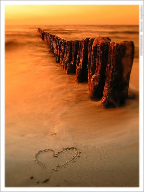
Photography is my favorite part of art, and love is my favorite part of life. Fusing the two together is my inspiration for everything. I love pieces that give off a warm feeling of love. This picture in particular appeals to me because I love the ocean, especially at sunset, and I adore summertime. I'm also a pathetic romantic, so anything that reminds me of love, I love! A lot of my art is this same classy, soft style. I love the calming effect it has!

Me...

Hey I'm Darcy =] I'm a freshman Graphic Design major at TCNJ. I love hanging with my friends and family, photography... I'm not really sure what to put here!! I have a bunch of experience with Photoshop&InDesign... 5 years worth... I was editor-in-chief of my high school's yearbook for 2 years. I want to go into the Creative Department of a corporation someday. And I'm excited for this class. =]